top of page
  • Writer: Charlotte Wilkinson
    Charlotte Wilkinson
  • Apr 16, 2024
  • 2 min read

Updated: Jun 17, 2024

For this 72 hour jam, I worked with a lovely team from all over and it was an excellent time! Our producer Clover set up a wee intro call prior to the jam starting, to let us all meet and get introductions out of the way before the jam.


For me, the jam theme was announced at 02:00am on Saturday 13th. I chose to stay up, allowing me to sync with the team and contribute to the brainstorming and early design stages.


a rough user flow map, leading from the main menu and specifying the contents of all possible paths, from Start game, settings, credits and quit.
Early User Flow based on orignal game concept, the core game loop was later adjusted to avoid having any reaction pop-up's between rounds. Instead the screen was split with 1/3 showng the characters reactions!


Once we settled on a game concept, I created a quick user flow and shared it with the team, to see what would be needed from the UI side for the different scenes/screens we'd like to include in the project, to avoid working on anything we didn't need.


Above are the final UI scenes, I created a small and cohesive suite of assets including in-game HUD elements, a title-logo, a custom cursor, settings slider bar & handle, button with three states and three easily re-scaleable containers for pop-ups and menus. While on call with the team once we settled on a game concept, I created some super sketchy wireframes, to explore different approaches to user interaction and layout of elements.


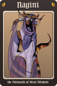
The next day was focused on syncing up with the team and with the character artist Micro, before developing a UI fitting the fantasy feel of their character work. I also created a background for the in-game scene, exported Micro's character expressions in-scale for the game, and used the character they created for the itch game page assets and in-game menu splash page. Later also moving on to create a chibi of the main characters' familiar to follow the players cursor, an illustrated hand asset (based on the character design) and five colour coded spell orbs each with a unique symbol to make the game more accessible for colour-blind individuals.


Through the jam, I utilised the web colour contrast checker on the UI colour pallet I developed, ensuring that it met Level AAA for our container and text elements to ensure better accessibility.

WCAG Compliance Test Result is shown, direct snippet from the web colour contrast checker.
WCAG Compliance Test Result
Level AAA - Text. This image shows is a brief overview of criterion to meet this standard.
Our in-game text would be classed as Large sample text as the smallest text is larger than 24px.

I also created the cover, banner and page background assets used for the itch and Ludum Dare game pages, ensuring they showcased the character work from Micro well, and incorporating the spell orbs and some sketched scroll outlines, alongside the smoky effect from in-game onto the itch page background to tie it all together.


In the end, we created a simple arcade style game, where you control Myoji's summoned goblin familiar inside their demi-plane. Rushing around to move spell orbs into and out of Myoji's path to help her pass her exam! We had a lot of fun working together on call via discord, so this was a really fun jam experience, and I'm excited to work on more jams with the team in the future! You can play Eyes on Myoji here or over on the Ludum Dare game page.

  • Writer: Charlotte Wilkinson
    Charlotte Wilkinson
  • Feb 6, 2024
  • 1 min read

Updated: Jun 10, 2024

I utilised the boss character sprites Sandra had created when designing the itch page for our project. I used the in-game UI containers as a starting point for where the text and screenshots of the game would go, taking the visual design of the Boss Cards I'd made and applying their colour pallet to this container. Below is the final iteration I made, where I also added the background Sandra created.


Earlier placeholder pages:


Boss Cards


To showcase Sandra and El's character sprites on the game page, I created some Boss cards, these were created for the itch page for anyone who wasn't able to progress past the earlier bosses. I later also created a wee card for the player character and their beloved cat Crumpet.


Final game page:


You can play Fools Gold here, or view the project page here.

  • Writer: Charlotte Wilkinson
    Charlotte Wilkinson
  • Jan 29, 2024
  • 2 min read

Updated: Jun 10, 2024

I was recruited onto a team for the Global Game Jam this year, working alongside Fabi, Jack, and Robyn. These are some friends of mine, who are lovely to work with, and they let me focus my time onto UI Design for the jam. I also aided with 3D asset creation once the UI was complete.


For us, the jam began at 5:30pm on Friday 26th. So it was around half-five we got on call to brainstorm. Fabi put forward a really cute, simple idea involving a spicy wee cat. The game was you pet the cat & periodically it will cronch onto you. Using a mixture of 3D and 2D assets with a diorama of a room as our environment.


Above are the final UI scenes, I created a small suite of assets including a title-logo, header font & body font, a custom cursor shaped like a mitten with two states, some toggle-able settings, a text box and content containers.


While on call with the team, I began with some super sketchy wireframes, featuring some cat sketches from Fabi.

several sketchy wireframes for in-game and menu screens for The Pet Pet Project.
Wireframes for The Pet Pet Project. Our goal was a small, simple project, so we avoided having too many settings or different scenes.

Once discussed, we thought it'd be fun to change the sliders in the settings menu into some selectable options, all of which were yes, but having varying degrees of energy (shown with boldness and scale). This was an idea Fabi suggested, to further emphasise our use of the Forrest Gump diversifier from the narrative section.


I was sure to check the contrast regularly on the project's UI early on, including later on when a set colour pallet had been established. I did this by using a black rectangle covering each artboard which was set to the blending mode saturation.


Greyscale look at games GUI for various screens
Example of contrast checking method described above.

I also utilised the web colour contrast checker on each of our suggested colour pallets, ensuring that we met Level AAA for our text elements to ensure better accessibility.

WCAG Compliance Test Result is shown, direct snippet from the web colour contrast checker.
WCAG Compliance Test Result
Level AAA - Text. This image shows is a brief overview of criterion to meet this standard.
Our in-game text would be classed as Large sample text as the smallest text is larger than 24px.

We made a cute, simple game with a 2.5D feel, blending a 3D environment with 2D character and set-dressings and cute UI to tie it together. We had a lot of fun working together on call via discord, we developed the game from Friday evening and over Saturday. Meeting up on the Sunday for a relaxing catch-up in person before the closing ceremony and play party. So, this was a lovely wee project to work on over around 24 hours, with some wonderful collaborators! You can play The Pet Pet Project here.

Interested in Collaborating?

If you're interested in working with me, you can commission me for freelance projects!
I have a number of bundles set-up over on my commissions page, to make things quick and easy, and all of the bundle's from GUI suites to game logos and marketing assets can be used for commercial projects.

I retain the right to showcase any and all work I create on my portfolio.
Although, I'm happy to hold off on sharing it until later, for example if your game is not public yet, just let me know when you reach out!

I'm highly adaptable, from 2D to 3D workflows to even game design. I'm technically minded with a background in software development, and skilled in rigging alongside animation for both 2D and 3D projects.

bottom of page